
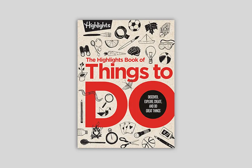
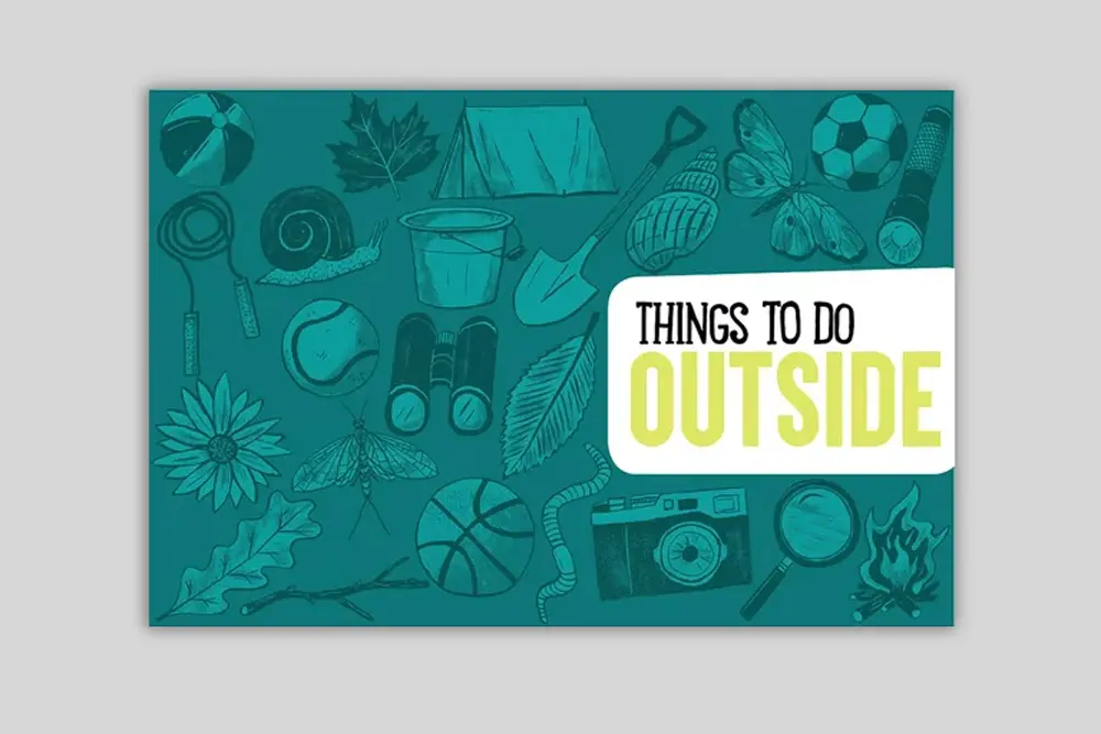
The Highlights Book of Things to Do
A design system for screen-free childhood joy
How Highlights’ archive and purpose shaped the project
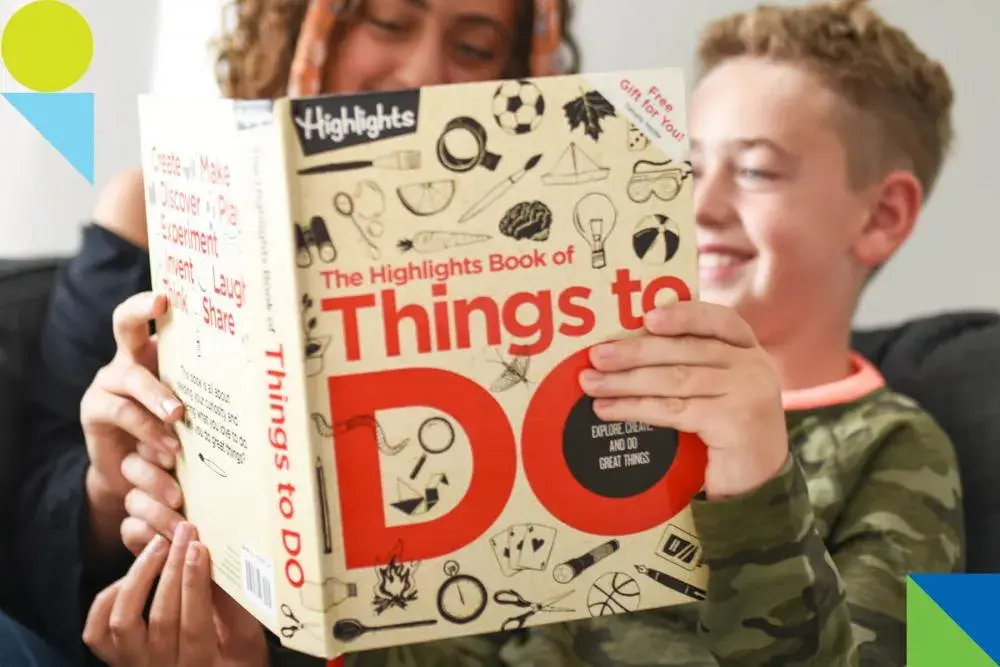
As lead designer at Alexander Isley Inc., I helped shape the design system for The Highlights Book of Things to Do—a 350+ page publication that reimagined the brand’s vast archive of activities, games, and crafts into a new format for families. Created in alignment with Highlights’ long-standing motto “Fun with a Purpose,” the book was designed to encourage off-screen exploration, creativity, and family connection. My work involved setting the visual tone, designing a modular system, and establishing style guides that would carry through the remainder of the book.
Translating a legacy of learning into a contemporary design system
This book was more than a compilation—it was a manifesto for purposeful play, arriving at a time when screens were becoming increasingly dominant in children’s lives. As a lifelong admirer of educational media and children’s publishing, I saw the opportunity to build something joyful, useful, and rooted in both nostalgia and practicality. The project balanced structure with spontaneity, inviting discovery while giving readers clear paths through the material.
Establishing a flexible structure for play, clarity, and joy
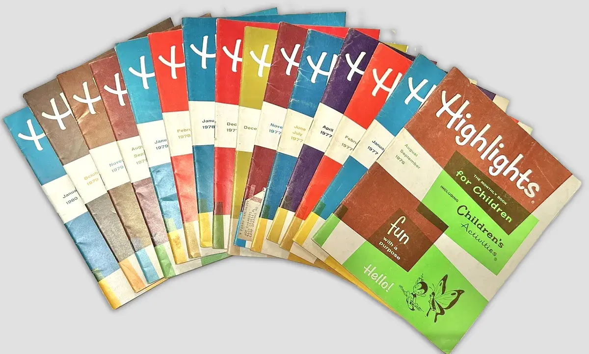
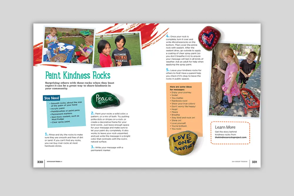
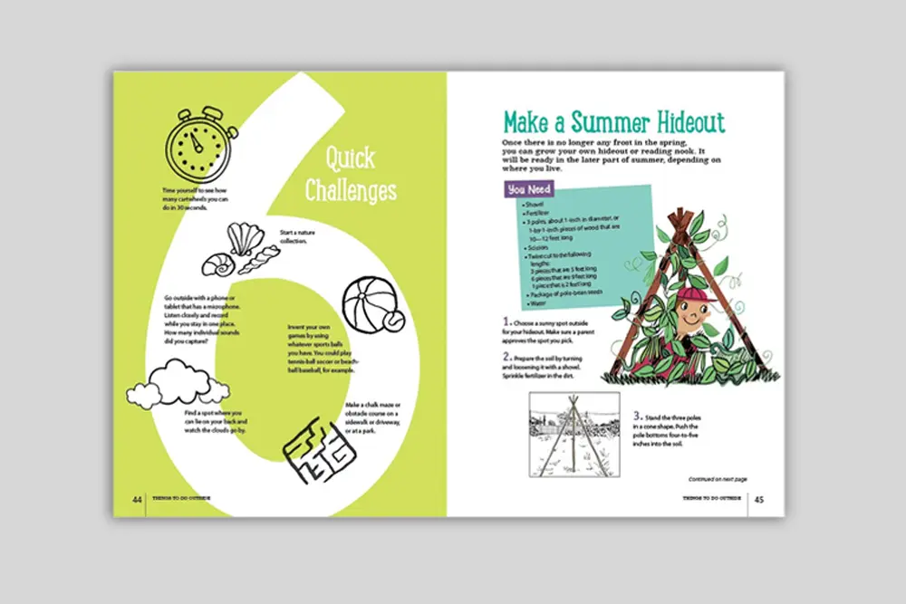
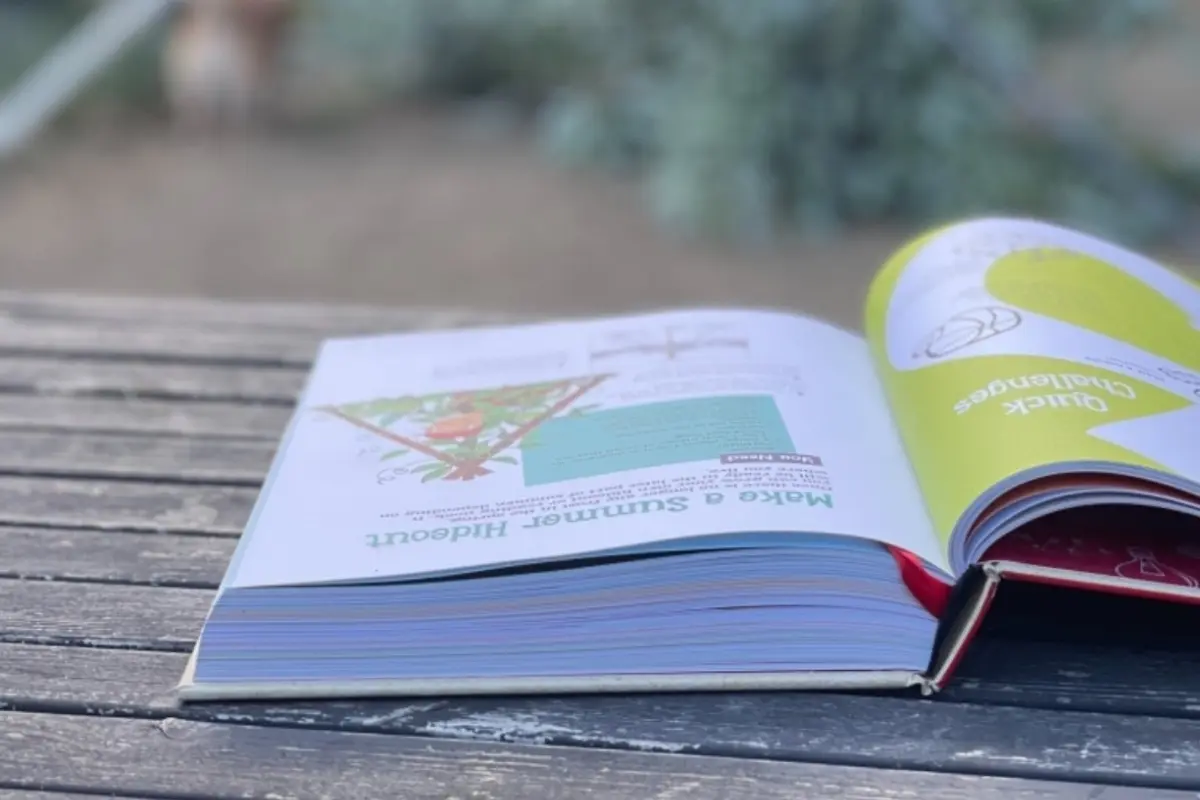
We began by immersing ourselves in Highlights’ archive and history, visiting the client onsite and pulling inspiration from beloved 1970s issues. Our team reinterpreted the visual cues of the past—amorphous shapes, woodblock textures, and print ephemera—through a modern lens. I established a system of design components that defined voice and function: for example, every recipe or material list was introduced with a consistent visual device, allowing kids and caregivers to intuitively grasp what was needed and what came next.
To ensure the content felt active and lived-in, we combined archival illustrations with silhouette photography, creating a tactile atmosphere while remaining within budget. I also led the effort to right-size the content to fit within the fixed page count, guiding the Highlights team to pare down the activities for better pacing and breathing room.
Designing joy with intention
This project is a distillation of my design identity: designing as a verb, a tool to make information accessible, experiences intuitive, and outcomes joyful. I care deeply about work that meets people where they are—especially when it comes to supporting learning and play.
The Highlights Book of Things to Do offered a rare chance to combine systems thinking with expressive storytelling, and I approached it with equal parts structure and childlike wonder.