

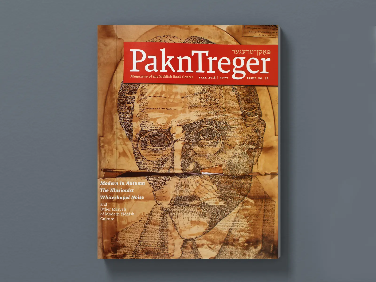
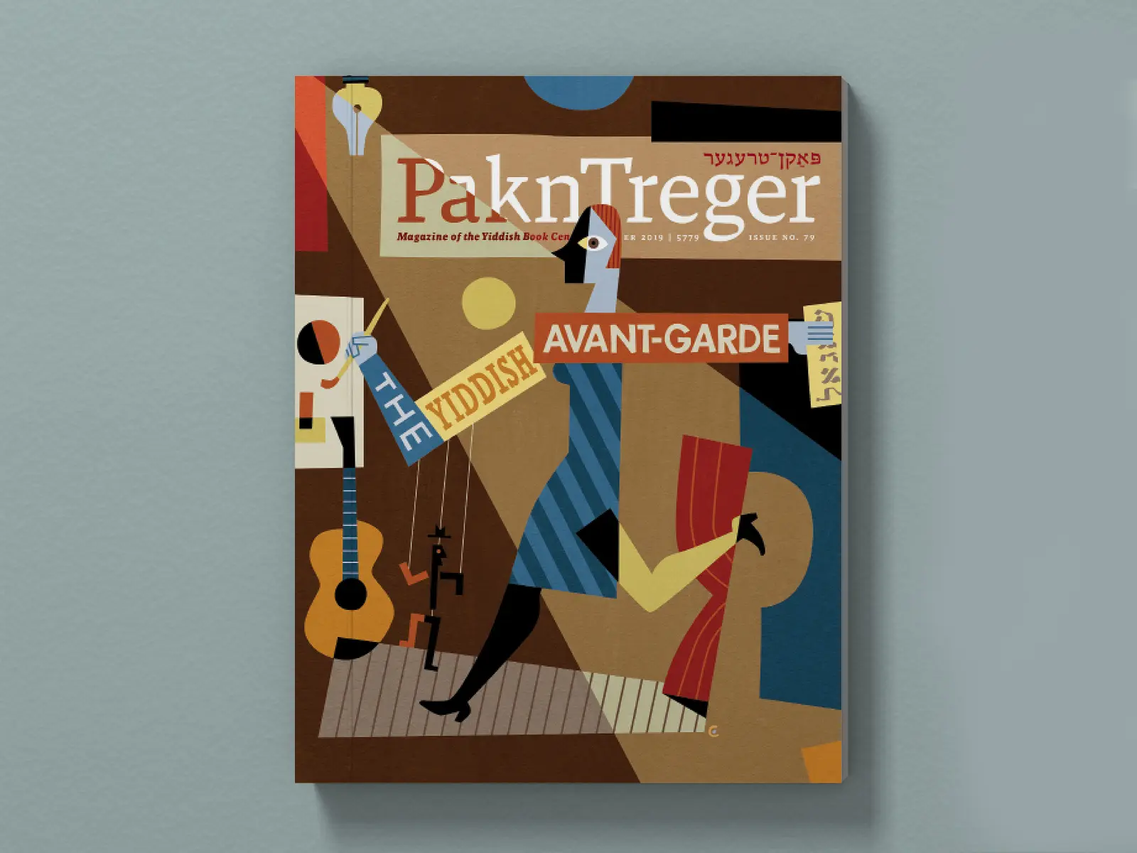
pakn treger
Editorial design for a biannual magazine reimagining Yiddish culture for a modern audience
Designing at the edge of history and now
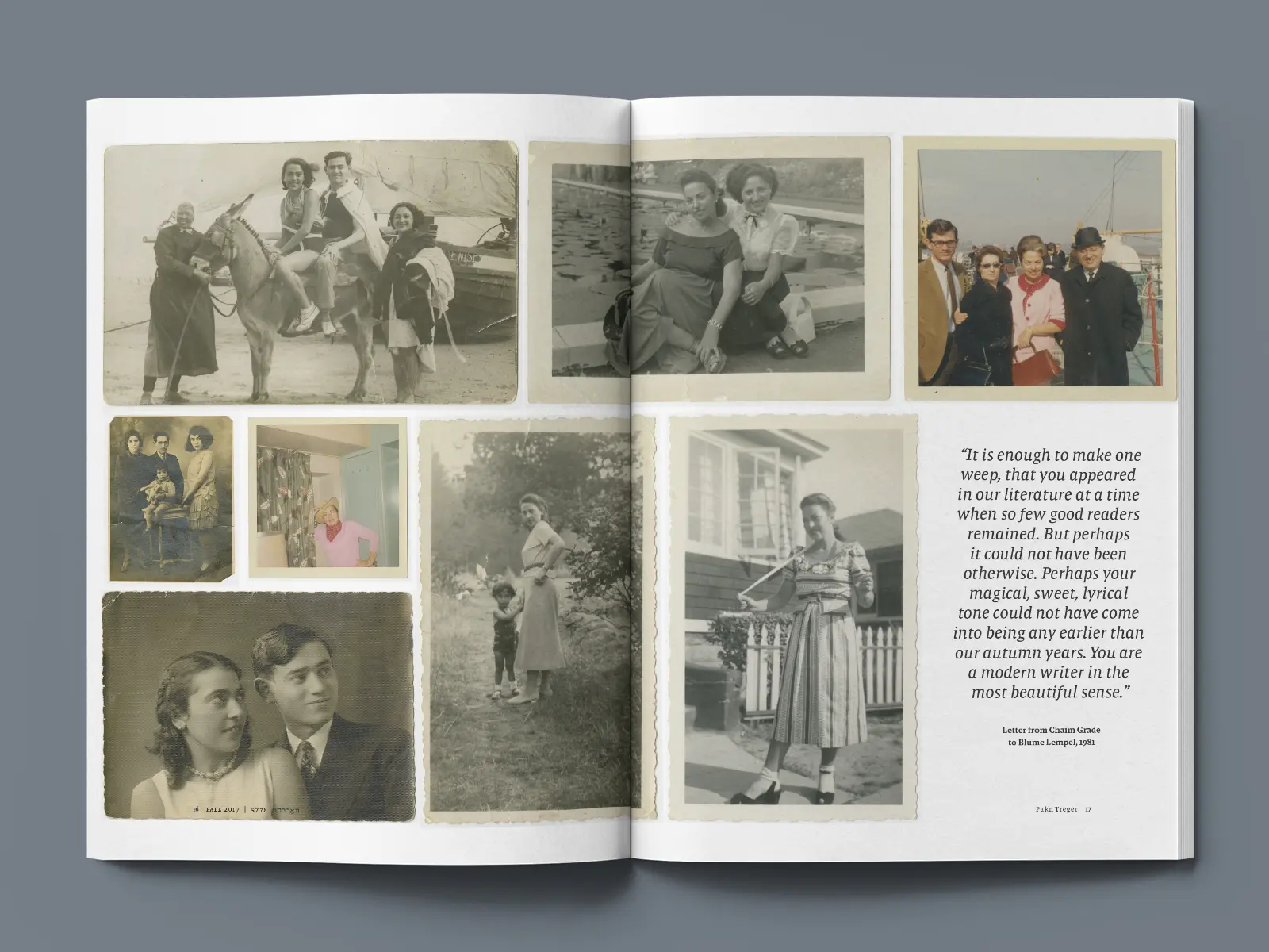
For over three years, I served as lead designer of Pakn Treger, the biannual magazine of the Yiddish Book Center. Each issue offered a new lens on Yiddish culture—its stories, scholarship, and modern relevance—and I worked to reflect that in the pacing, energy, and tone of the design.
The audience ranged from Yiddish scholars and longtime supporters to Hampshire College students discovering the culture for the first time. The challenge: build a magazine that could feel both reverent and fresh, without losing its grounding in history.
My goal with every issue was to honor the legacy, while quietly updating its voice for new readers. This meant listening deeply to the stories—and designing for the feeling of discovery.

An editorial system that makes room for rhythm
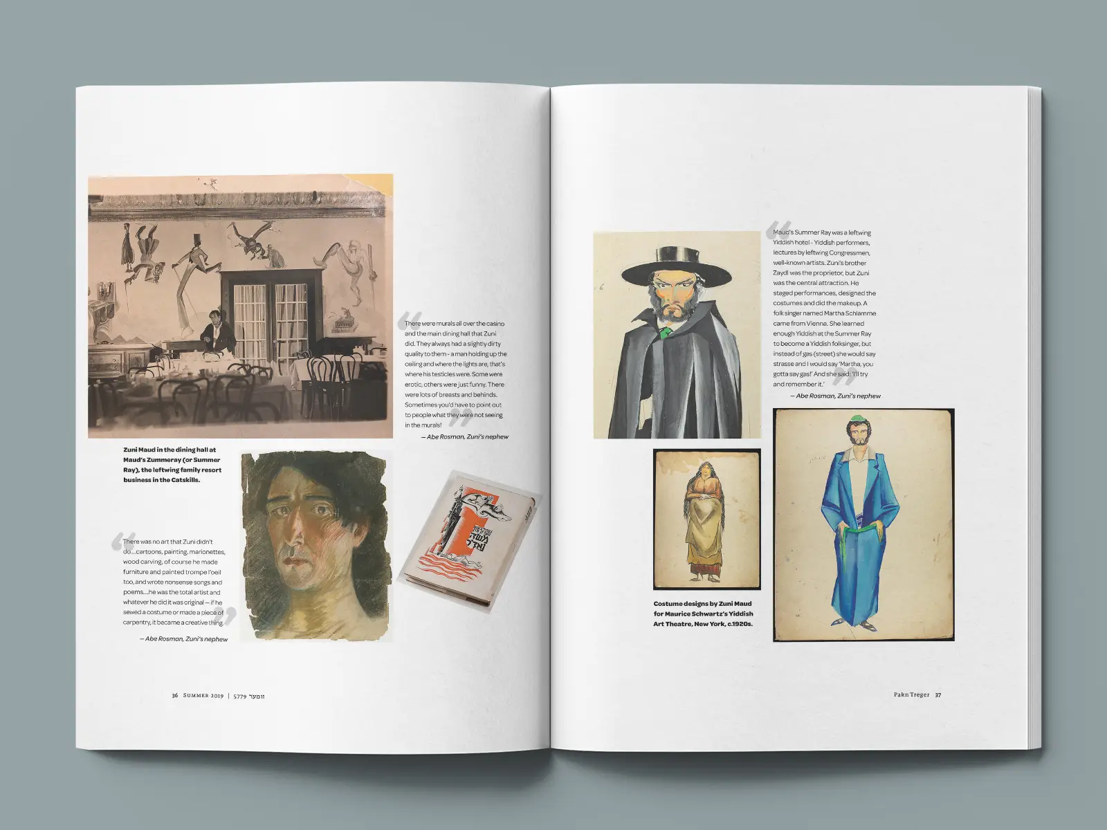
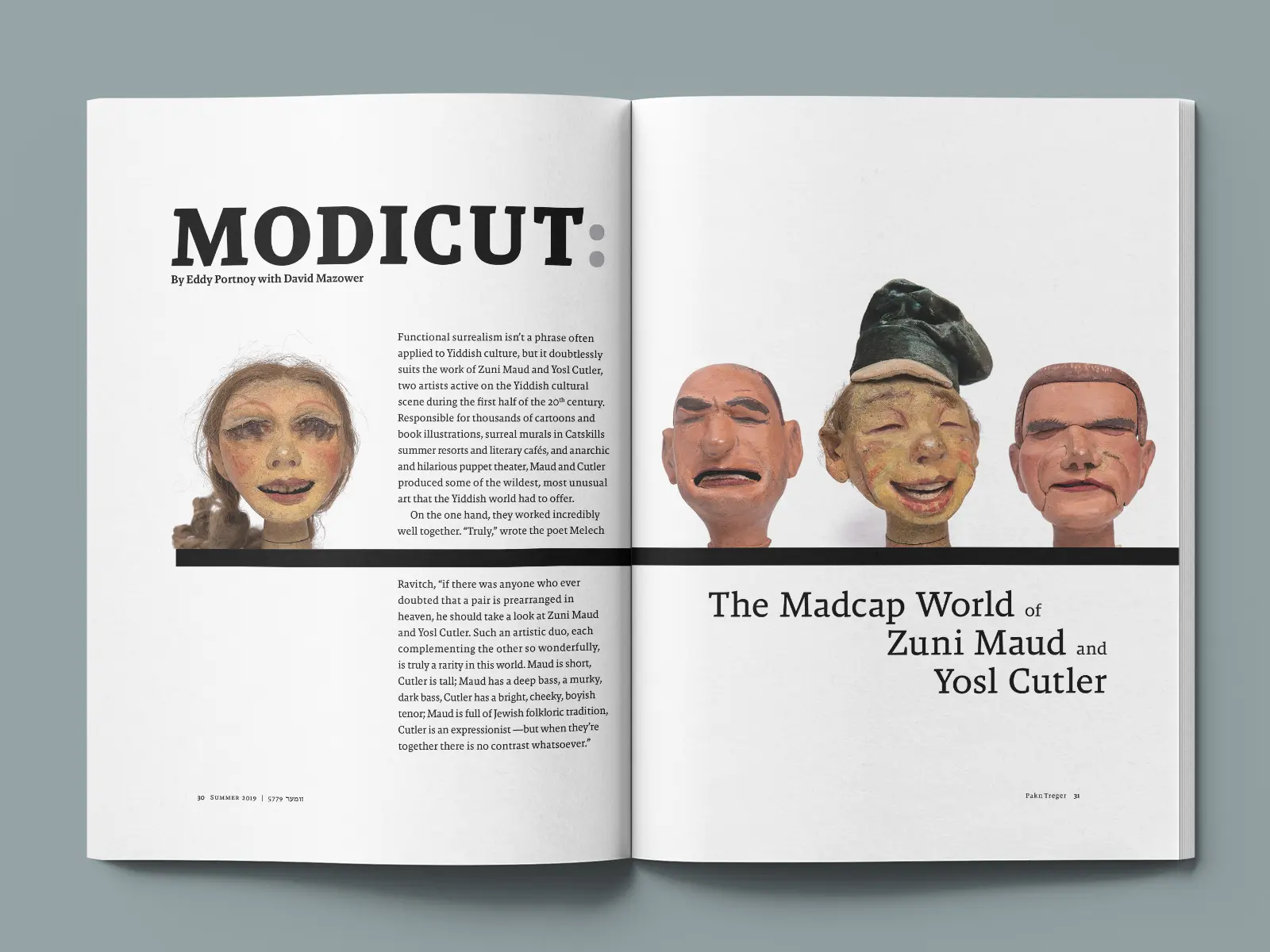
I managed six issues in full, handling the project from text delivery to prepress—including all communication with the client, translators, and illustrators.
Each issue was produced on a tight timeline, often turned around within a month. There were no ads to punctuate the flow, and the brand guide offered only two typefaces and no color system. In that constraint, I found structure—and freedom.
My responsibilities included:
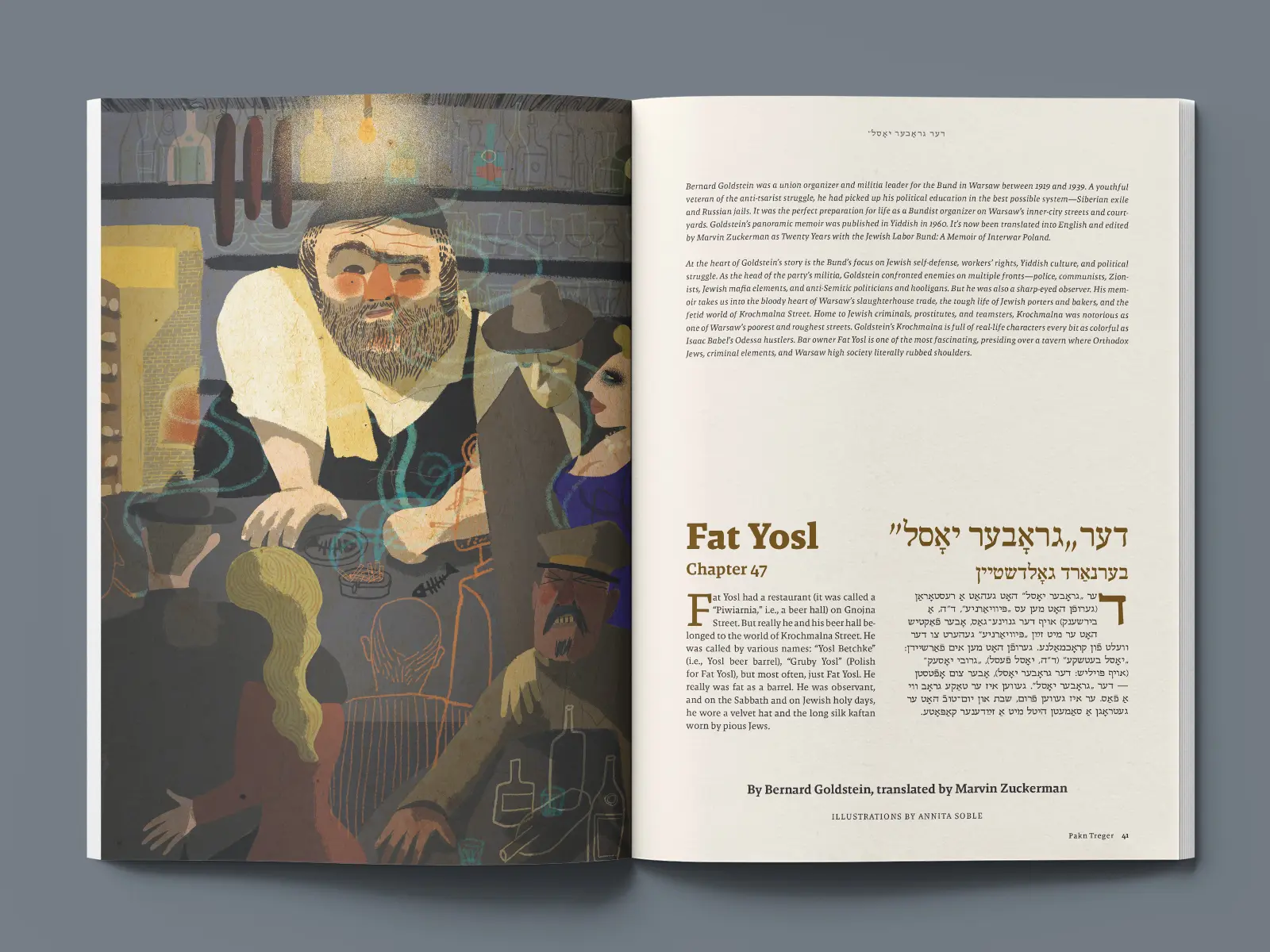
- Commissioning illustrations tailored to each story
- Art directing contributors I personally researched and sourced
- Designing layouts that gave stories space and clarity
- Managing bilingual typography for both English and Yiddish text
- Proofing, production, and digital versions of select issues
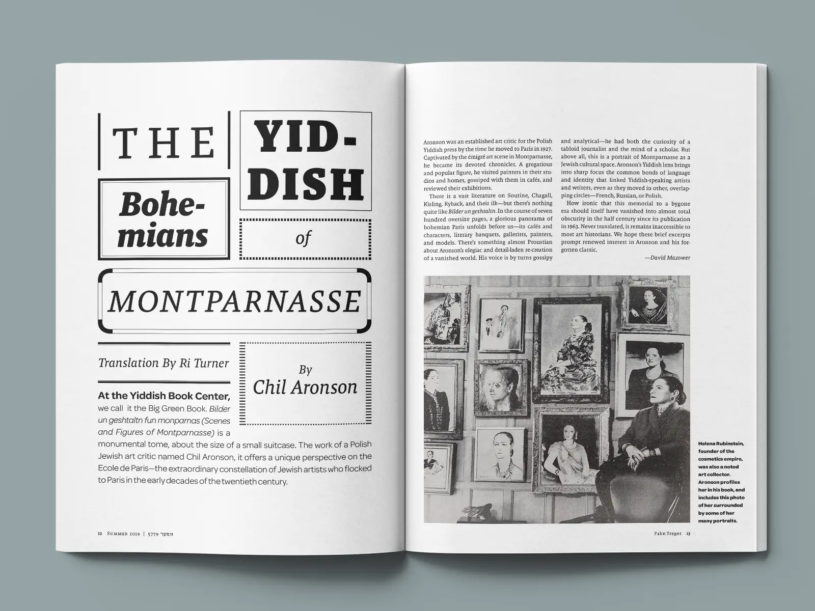
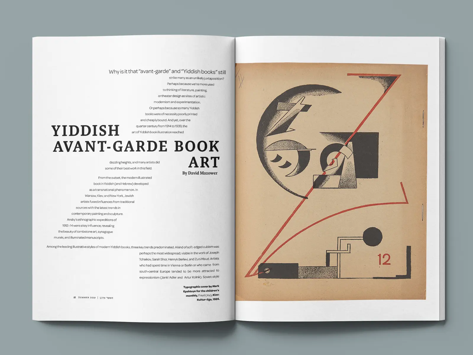
One of my favorite spreads—“The Yiddish Bohemians of Montparnasse”—was inspired by an original 1920s ad I found among the assets. I interpreted it into a full opener layout that mirrored the issue’s theme of avant-garde expression in a contemporary way.
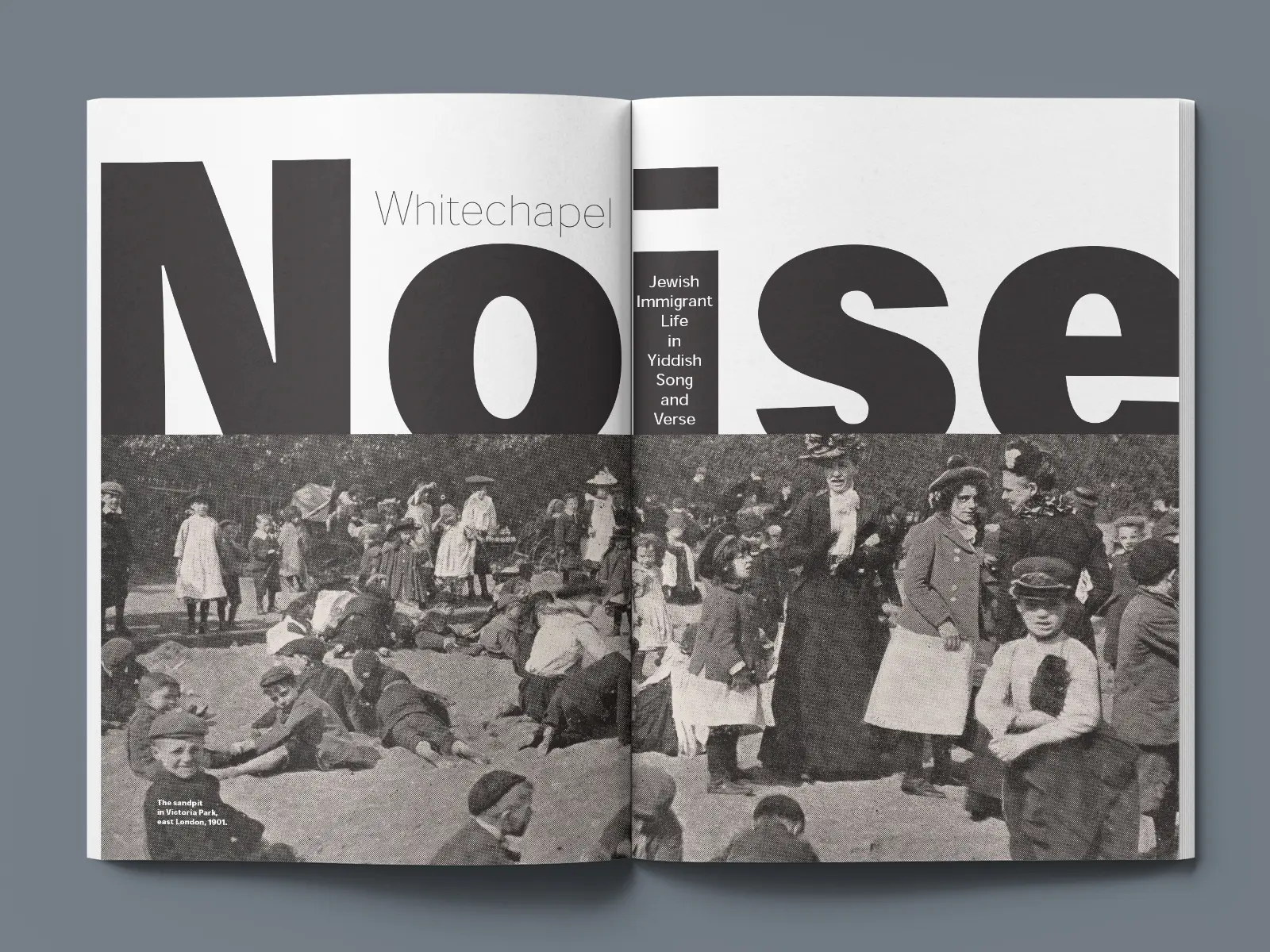
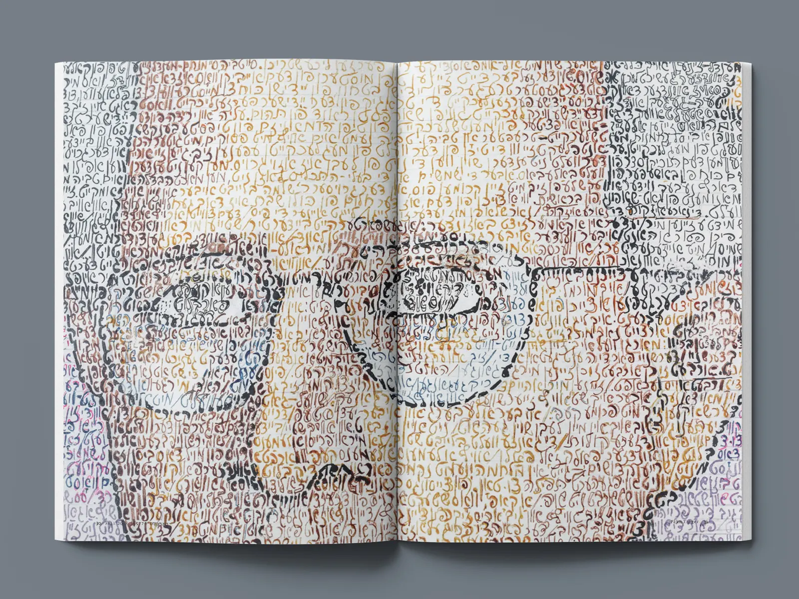
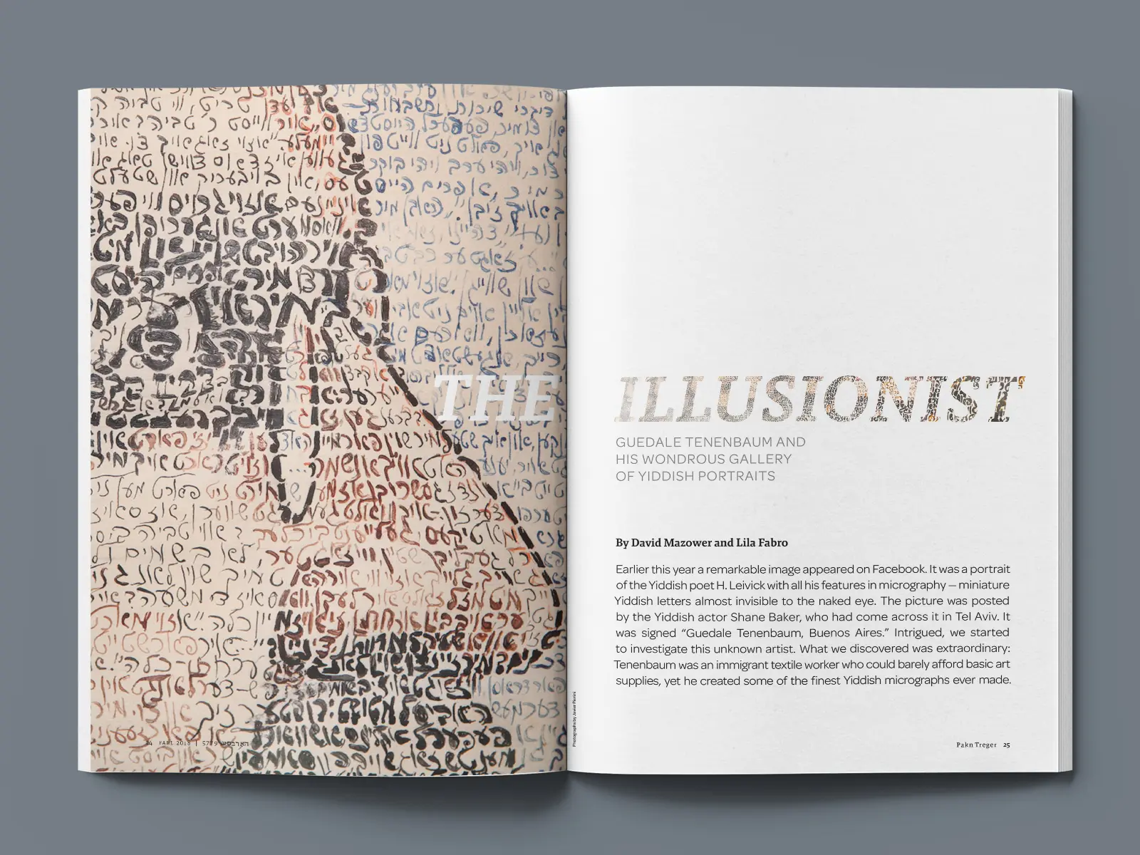
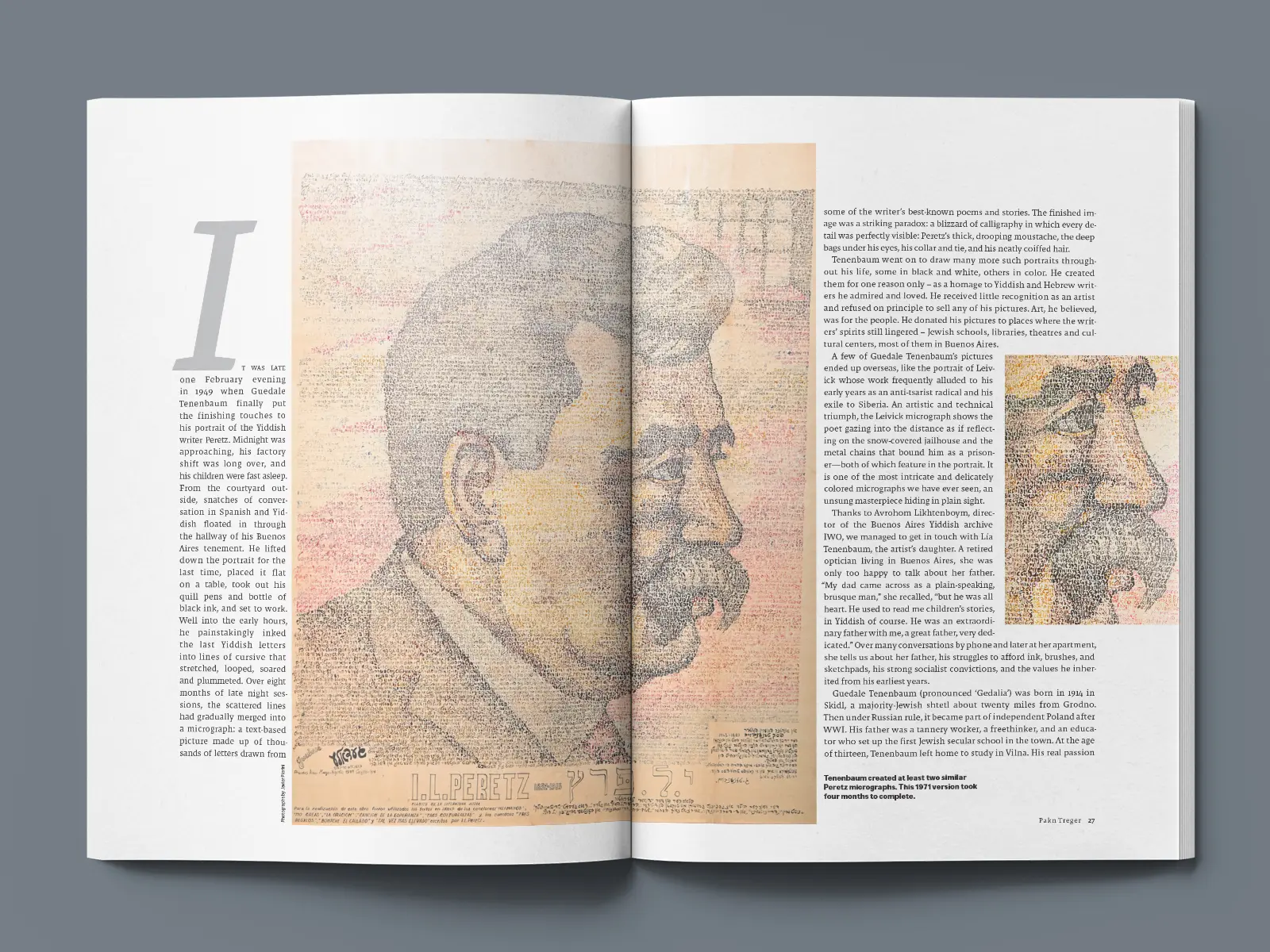
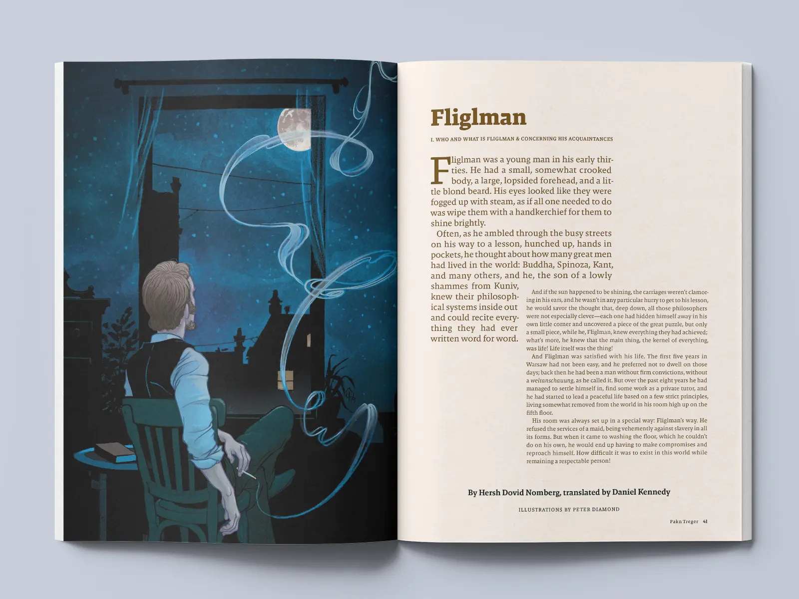
In another article, The Illusionist, I cropped tightly into the featured artist’s work—using visual intimacy as a storytelling tool. That level of trust from the client allowed me to treat design not just as framing, but as a deeper part of the narrative.
Cultural continuity through creative constraint
With no advertising breaks, I designed dynamic openers and visual transitions to give each article a sense of separation and intention. The layouts needed to guide, not just decorate.
The magazine’s minimal brand system gave me the freedom to rely on form, scale, and typographic tension to build a distinctive rhythm—one that felt cohesive, but never repetitive.
The impact of the design occasionally reached beyond the page. One reader even tagged the magazine on Instagram, sharing original artwork they had made inspired by an issue. That small moment affirmed what I hoped the design could do: make a legacy culture feel not just accessible, but personal and creative.
Design that listens across time
Designing Pakn Treger affirmed one of my core beliefs: that design is not just about what we make—it’s about what we make space for.
Each issue reminded me how timeless these stories are. Some were written over a century ago but still felt more relevant than much of what’s published today. My role was to surface that continuity—to build a system that helped modern readers see themselves in the work, and see Yiddish culture as something still in motion.
It was an honor to hold that lens, and to be part of a project where clarity, care, and culture intersect so closely.