
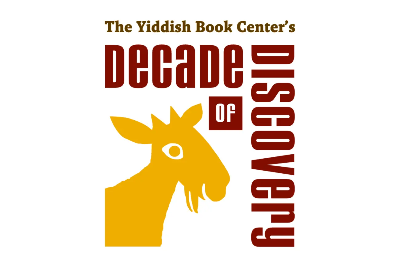
decade of discovery
Designing Cultural Continuity
A modular identity system for a decade of evolving cultural programming.
When the Yiddish Book Center approached its 40th anniversary, the organization launched Decade of Discovery—a ten-year initiative exploring the ongoing relevance of Yiddish literature, Jewish storytelling, and cultural scholarship through annual themes, events, and partnerships.
Most identity projects solve for a moment.
This one needed to support ten years of unknown programming.
Each year would introduce new curatorial themes, different speakers and collaborators, and programming hosted across institutions throughout North America. The visual identity therefore needed to do more than signal a campaign—it needed to govern a decade of cultural expression without losing coherence.
Rather than designing a static mark, I built a modular identity framework that could expand and contract alongside the initiative’s evolving content.

Designing a Framework for Cultural Evolution
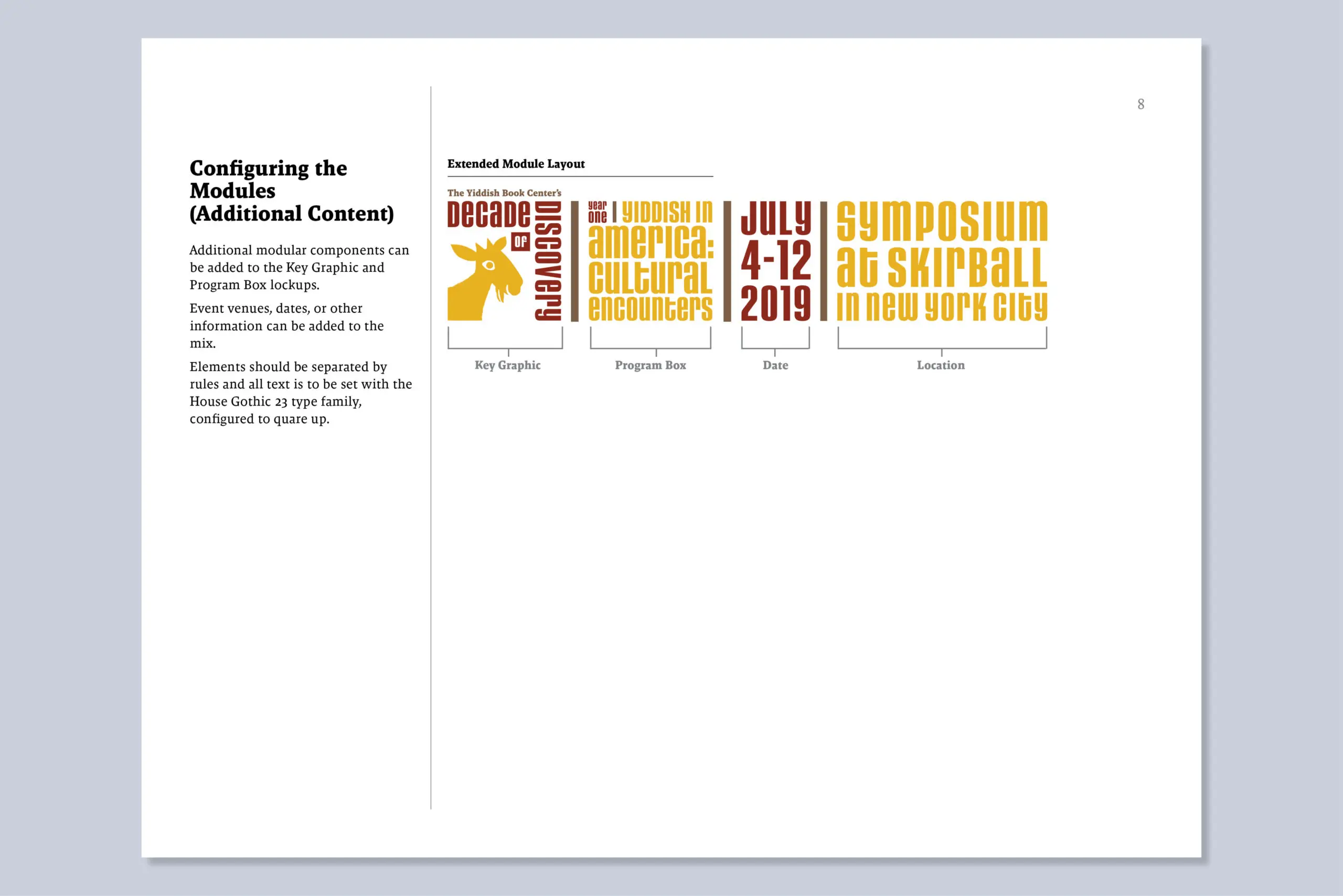
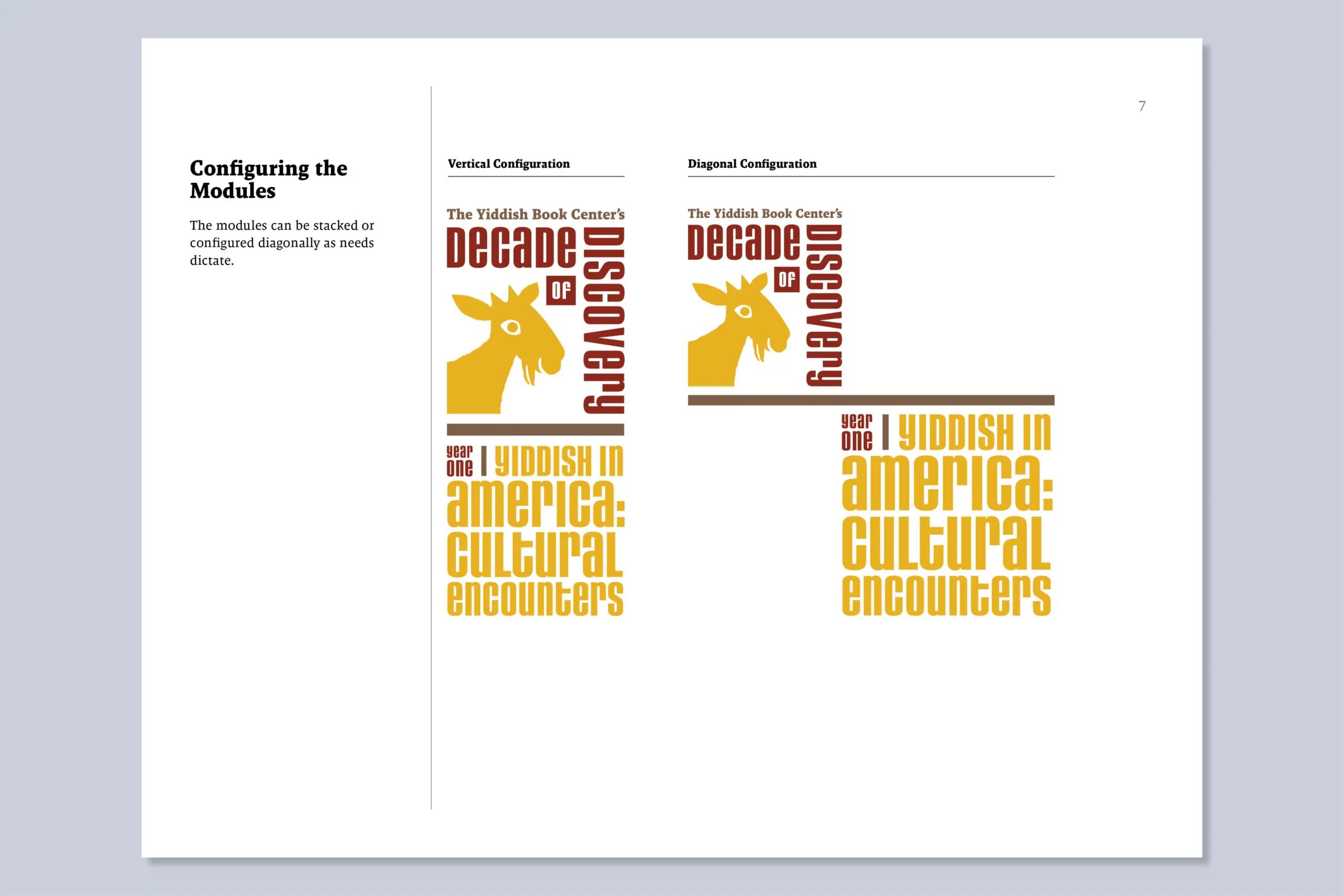
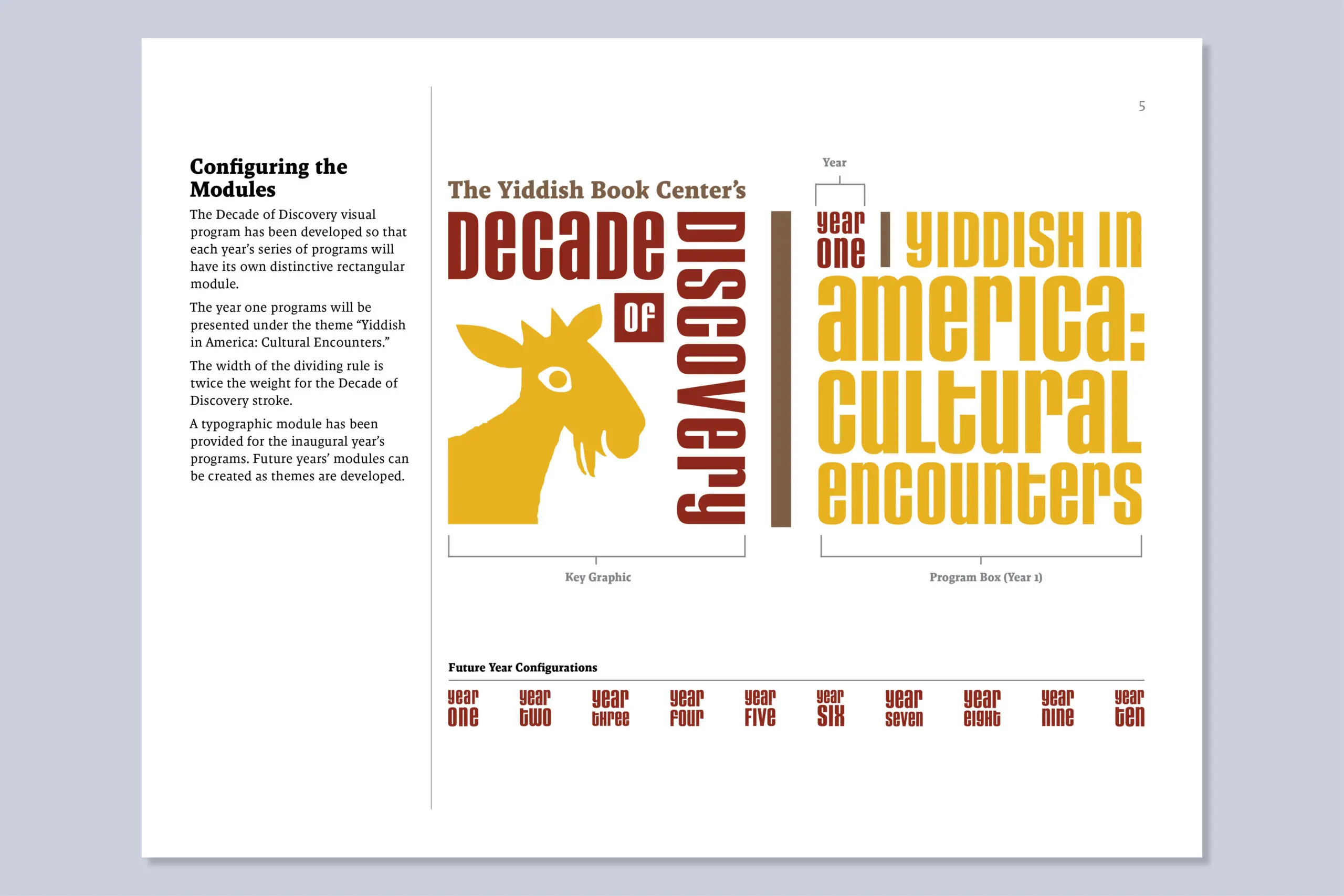
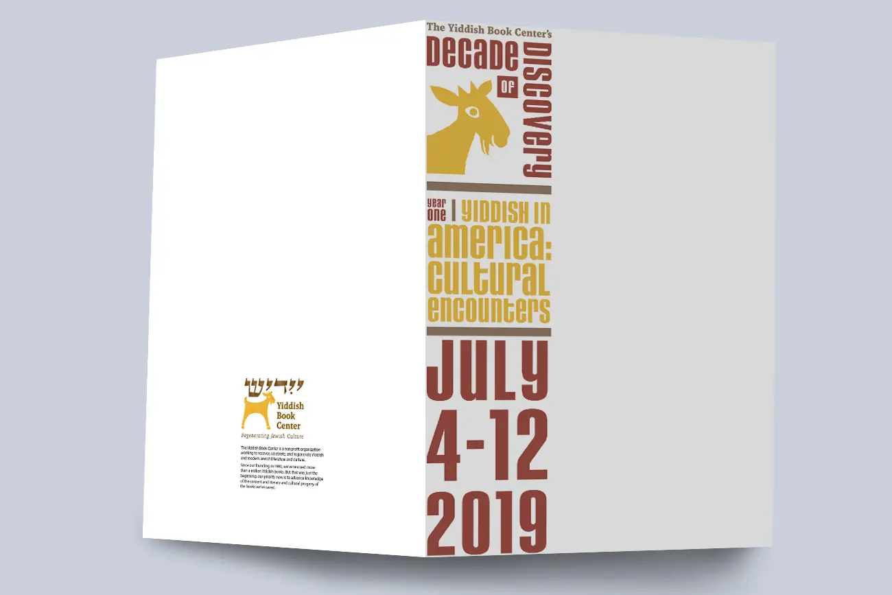
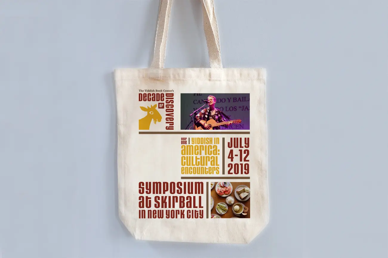
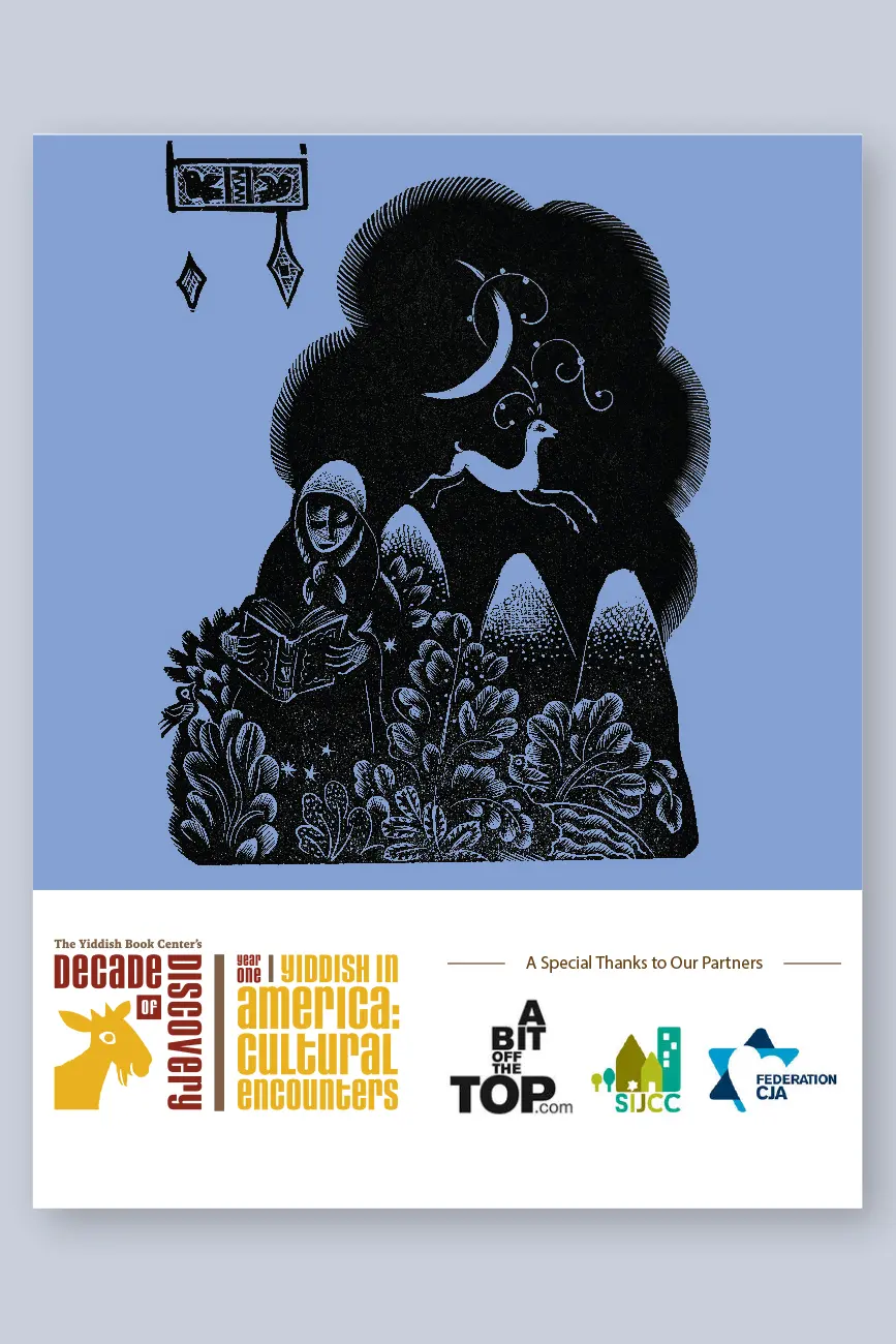
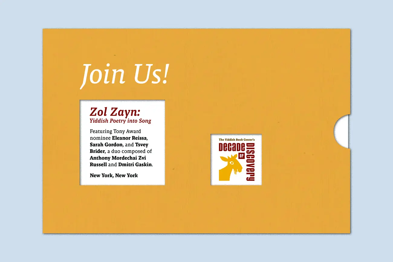
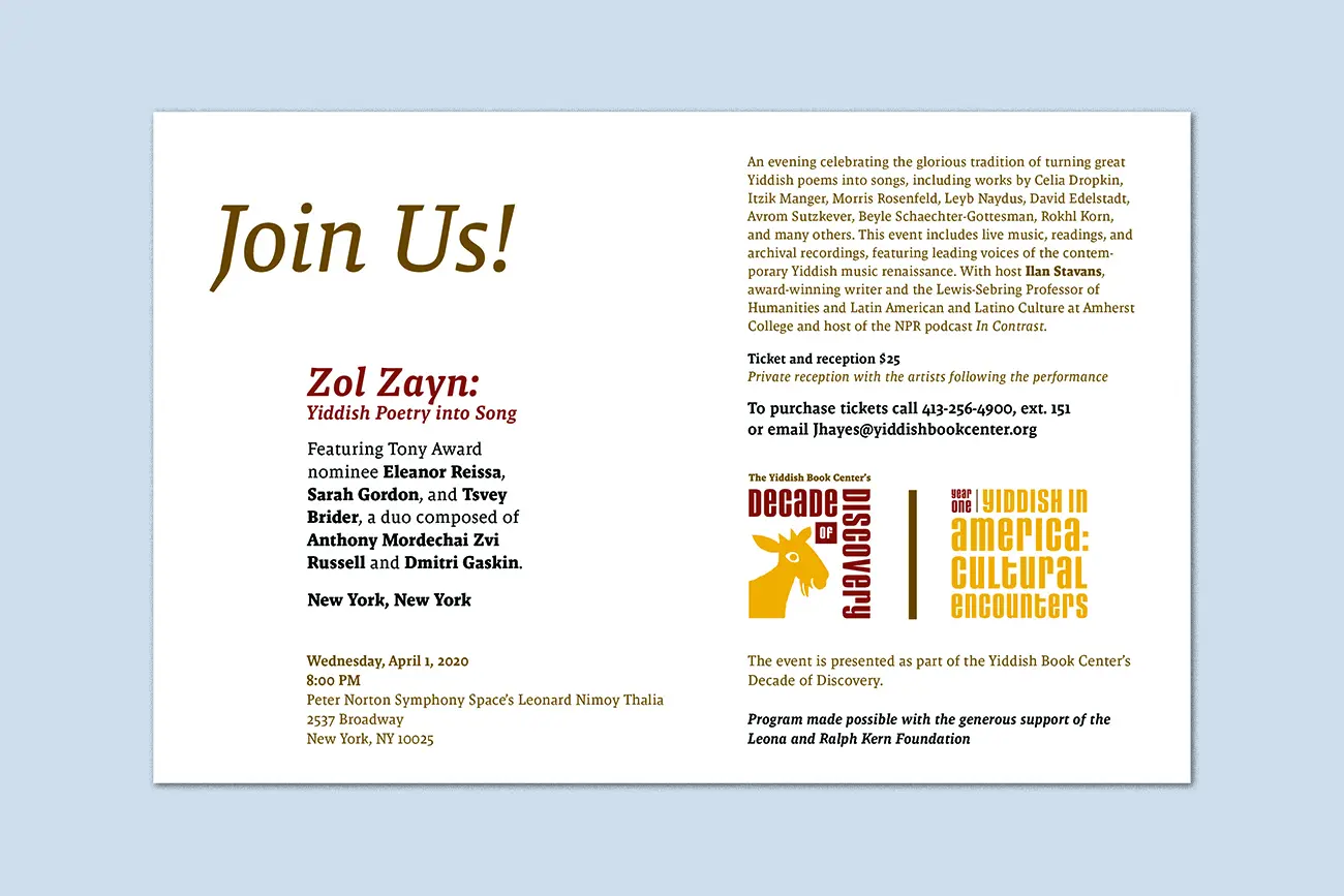
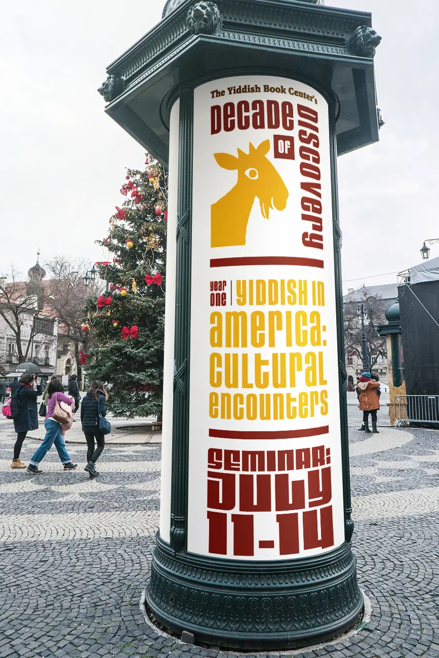
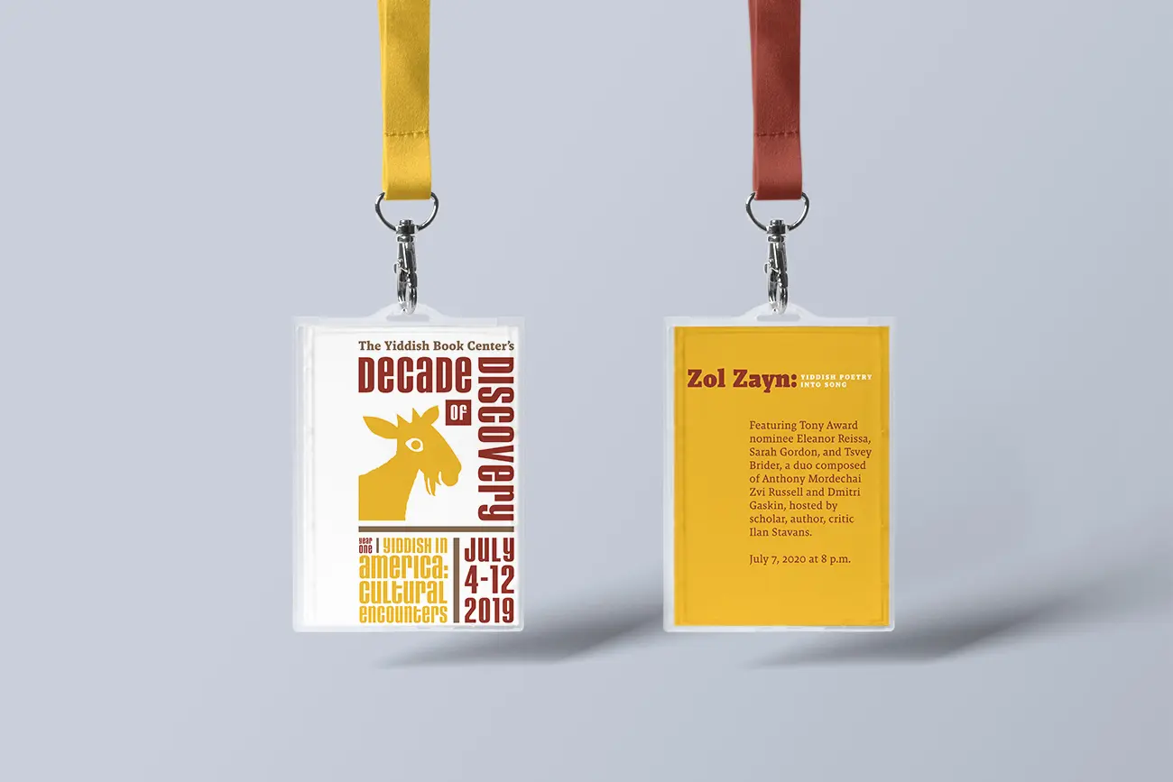
At the center of the system is a structural container that organizes the relationship between the program name, yearly themes, partner institutions, and event metadata.
This framework acts less like a logo and more like a governing structure—ensuring that each year’s materials could accommodate long academic titles, partner organizations, and new thematic narratives while remaining visually recognizable as part of the same initiative.
By defining rules for hierarchy, alignment, and typographic scale, the system allowed designers to generate new campaign expressions annually without redesigning the identity itself.
The result was a framework capable of supporting both consistency and evolution.
Balancing Cultural Legacy and Contemporary Voice
The Yiddish Book Center occupies a unique cultural space. While its mission centers on preserving historical literature and language, its programming engages contemporary questions around immigration, identity, politics, and modern Jewish life.
The identity therefore needed to balance two sensibilities:
- institutional authority, reflecting the Center’s role as a cultural archive
- living culture, expressing the vitality of contemporary programming
Typography became the anchor of this balance. The chosen typeface carries enough character to reference cultural heritage while maintaining the structural discipline necessary for a long-term identity system.
Through the modular structure, each year’s theme could develop its own voice without fracturing the overall visual language.
Designing for Unknown Futures
Instead of prescribing a single aesthetic style, the identity functions as a set of composable modules that can be reconfigured depending on content and format.
The system supports:
- annual thematic campaigns
- event posters and programming materials
- print communications such as mailers and folders
- digital applications including social media and institutional partnerships
Because the logic of the system governs hierarchy and composition, designers can adapt it to new themes without introducing visual drift.
The design therefore behaves less like a campaign and more like cultural infrastructure.
Enduring Continuity
Years after its launch, the system continues to support the initiative’s evolving programming. New themes and collaborators have been introduced without requiring structural redesign, demonstrating the resilience of the underlying framework.
What began as an anniversary initiative ultimately became a durable identity architecture—one capable of sustaining a decade of cultural storytelling while preserving institutional coherence.