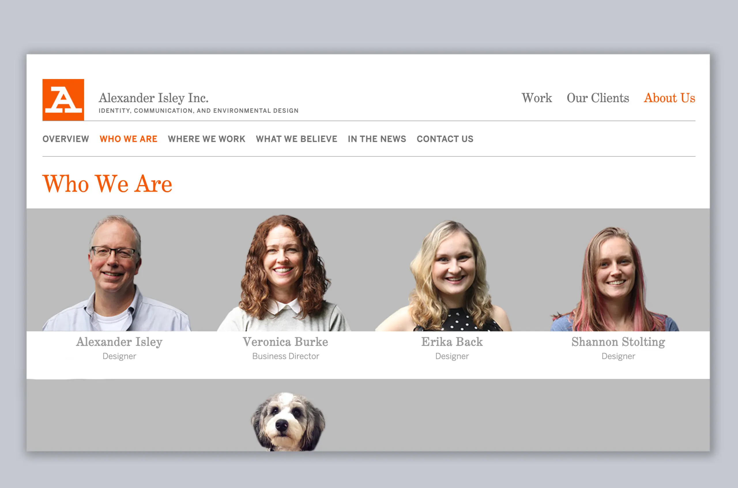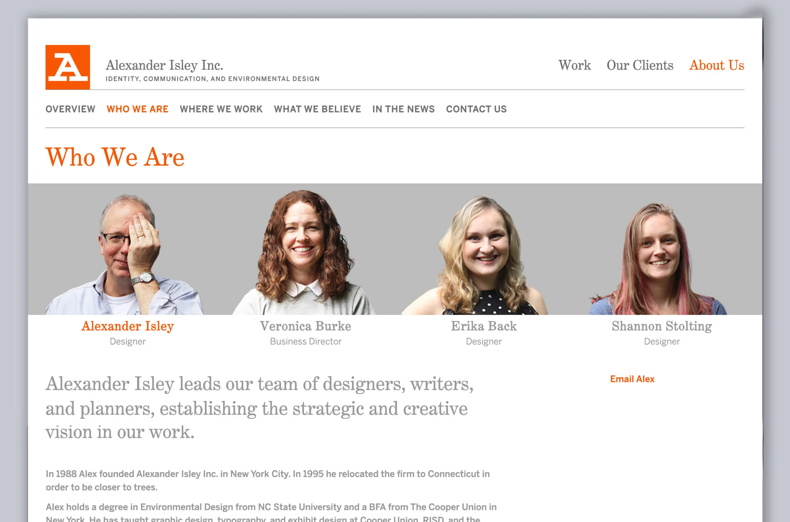
Alexander Isley Website
Having a diverse and extensive client list, it’s always important to manage an easily navigable website that features the best a studio has to offer.
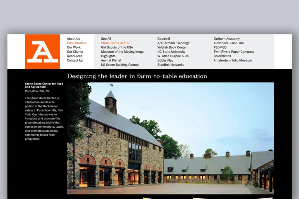
The previous site navigation was dark and featured small images. The navigation followed a four-column, horizontal grid.
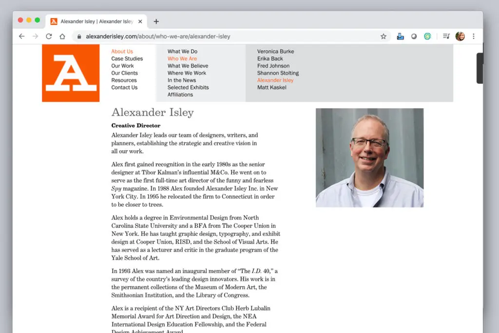
The old staff bio pages were long paragraphs that were difficult to access.

Brief & Idea.
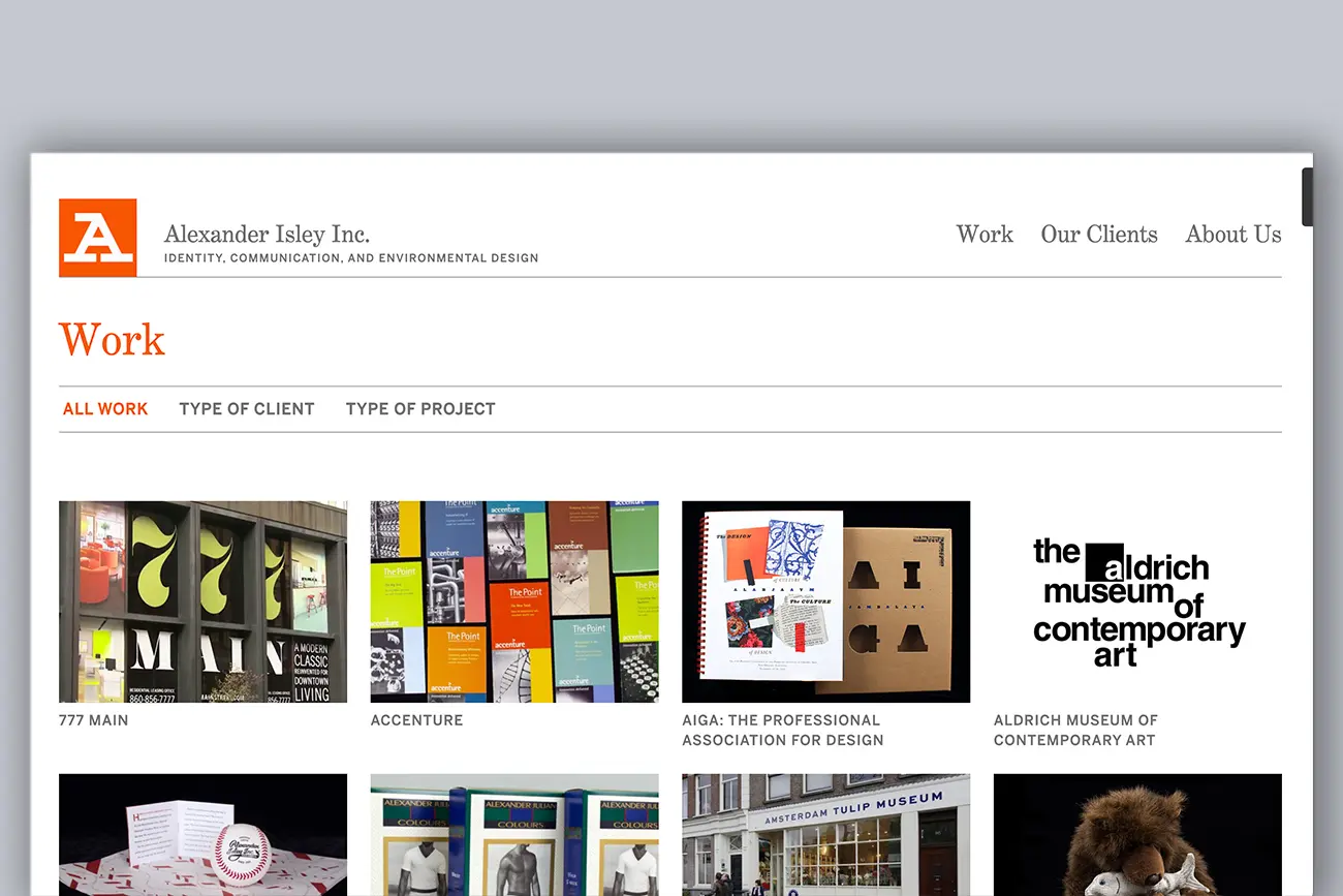
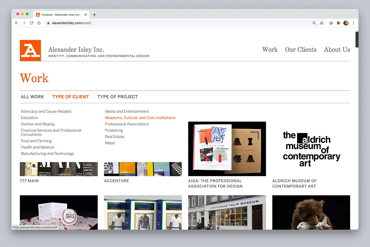
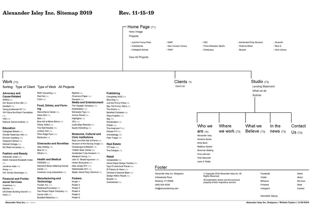
We would address client issues of finding relevant work quickly. Based on experiences with clients, they feel comfortable knowing that a studio was successful in other projects similar to theirs.
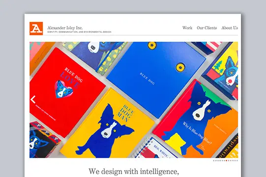
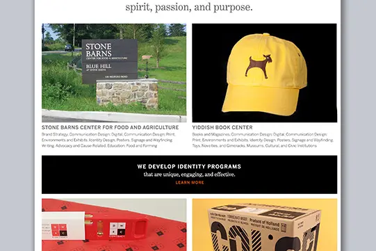
Our second priority would showcase our work in the best way possible. We needed large, spacious imagery, that would invite clients to spend time enjoying our work.
Result.
With an updated content management system, hosting, and site architecture we developed a refreshing design that would allow for spacious imagery revealing the details of our work. With an easy-to-update platform, we were able to showcase a large and diverse portfolio of our offerings. The “work” page sorting feature streamlined user experience to find projects most relatable to their design needs.
percent increase in the average daily user count

