

Yale Canopy
Designing an editorial experience that honors both transformation and tradition.
A message in a moment of uncertainty
In the spring of 2020, the Yale School of Forestry was undergoing a transformation. With a broadened mission and an expanded environmental agenda, the school officially changed its name to the Yale School of the Environment. That same spring, COVID-19 lockdowns altered student life—and graduation itself—beyond recognition.
This issue of Canopy needed to do more than announce a name change. It had to quietly assure students and alumni that Yale’s legacy was still alive, while celebrating new directions and new leadership. It had to feel vibrant, hopeful, and trustworthy—all in the middle of a global pandemic.
Designing with empathy and editorial precision
I designed a fold-out cover flap that housed the name change announcement—physically enacting the idea of an “unfolding future.” This gesture couldn’t be replicated in digital reading; it was designed as a tactile moment of discovery, unique to print. It gave the announcement weight, space, and ceremony.
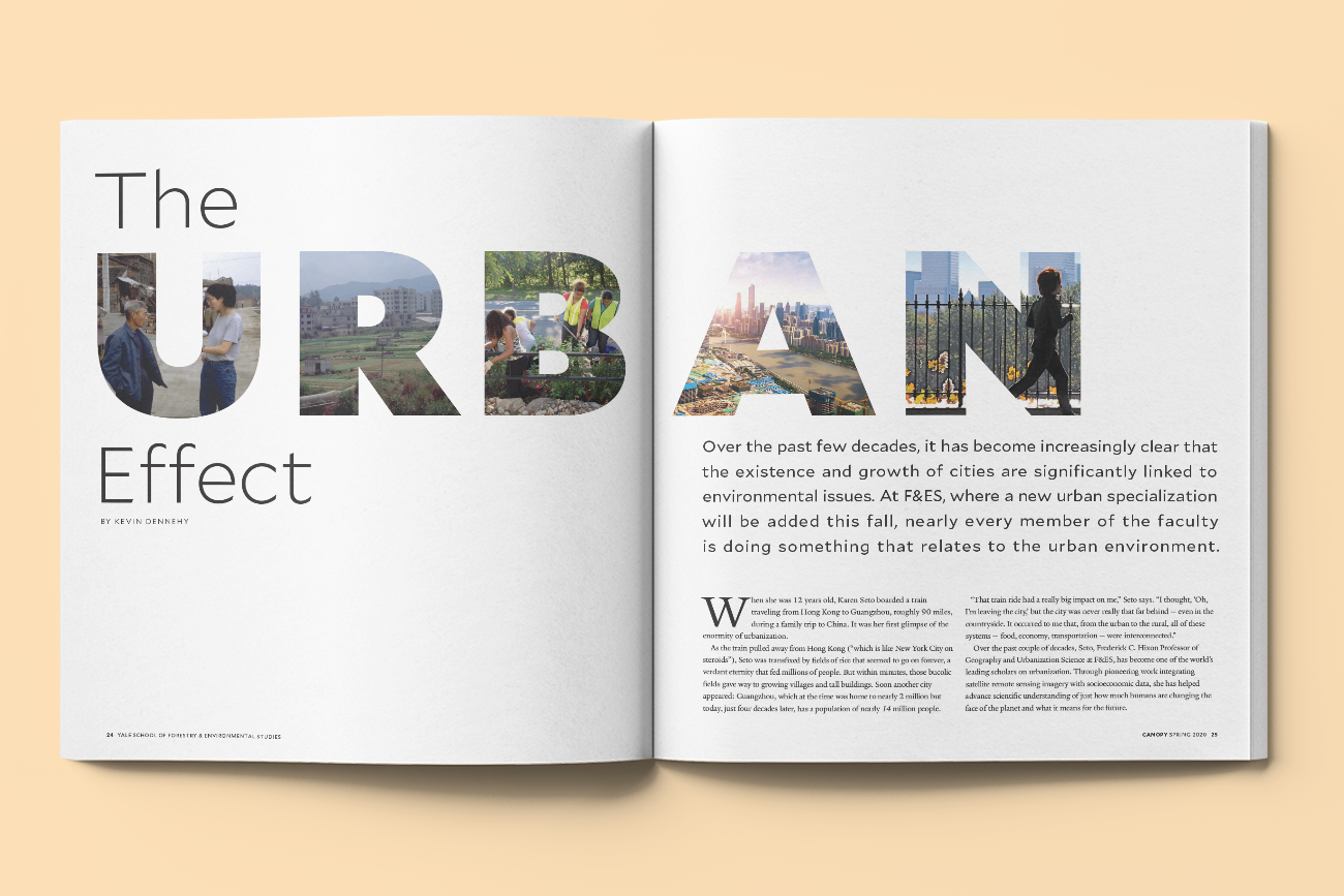
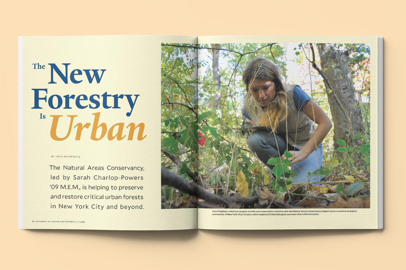
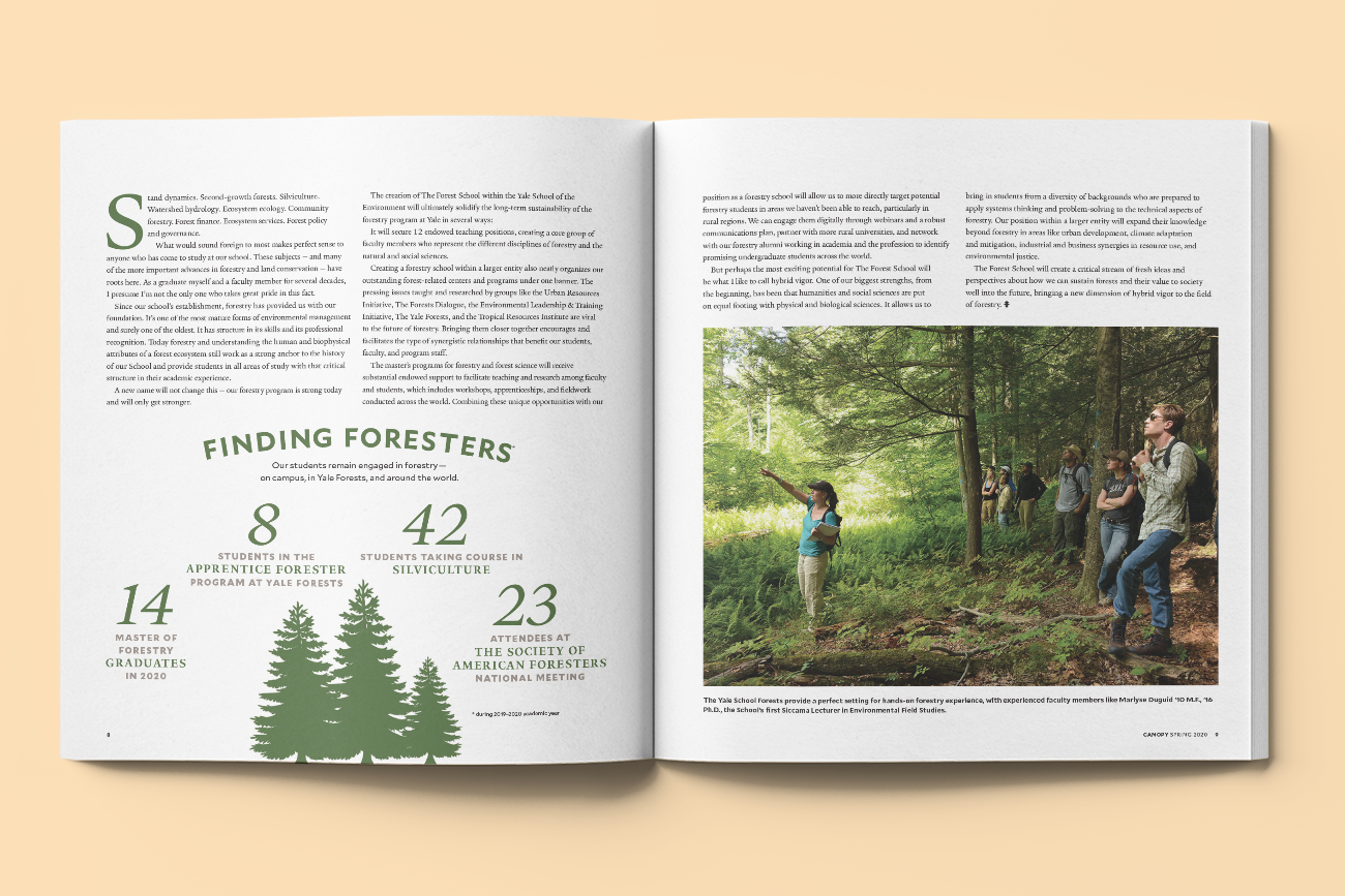
Within the issue, I commissioned editorial illustrations and infographics and helped curate image assets for a self-submitted graduation section—normalizing the uneven quality of COVID-era photography with thoughtful cropping and consistent pacing. In a feature called The Urban Effect, I created a wordmark cutout with layered photography to reflect the diversity of ecosystems covered in the piece.
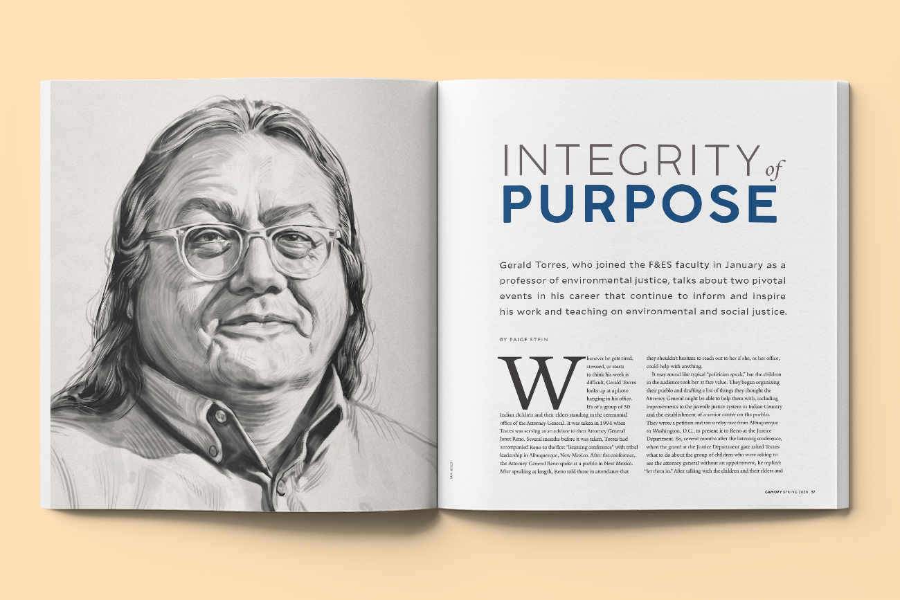
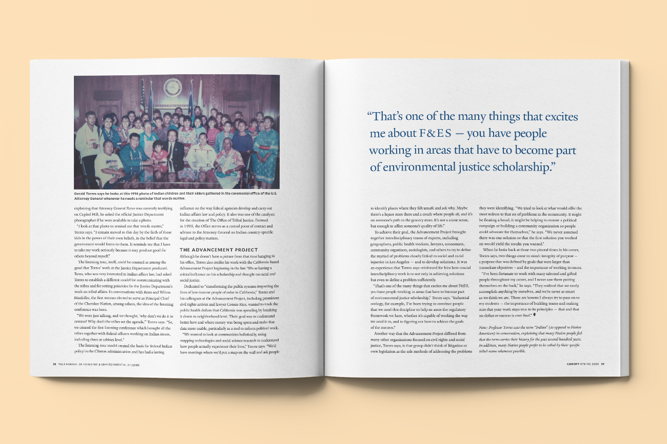
Each section was paced for dignity and momentum. One story, a profile of Indigenous environmental law expert Gerald Torres, was particularly affecting. I approached that layout with care—letting space, restraint, and structure speak more than the design itself.
Sustainability as invisible strategy
When investigating how to fasten the flap for mailing, I began asking questions about the production process itself. The printer had defaulted to a petroleum-based spine glue that made the magazine non-recyclable unless manually disassembled.
I researched alternatives and worked directly with the press to switch to a water-based, more sustainable glue—a solution that dissolved easily, made the book fully recyclable, and didn’t increase production costs. This change has since been adopted for future issues.
A quiet legacy
This issue was mailed at a time when no one could walk the stage. In that vacuum, the design had to stand in as a proxy for joy, transition, and belonging. It didn’t shout, but it marked a milestone. It gave students something they could hold.
Design doesn’t always need to speak loudly to make a point—it can whisper, and still leave a mark.